

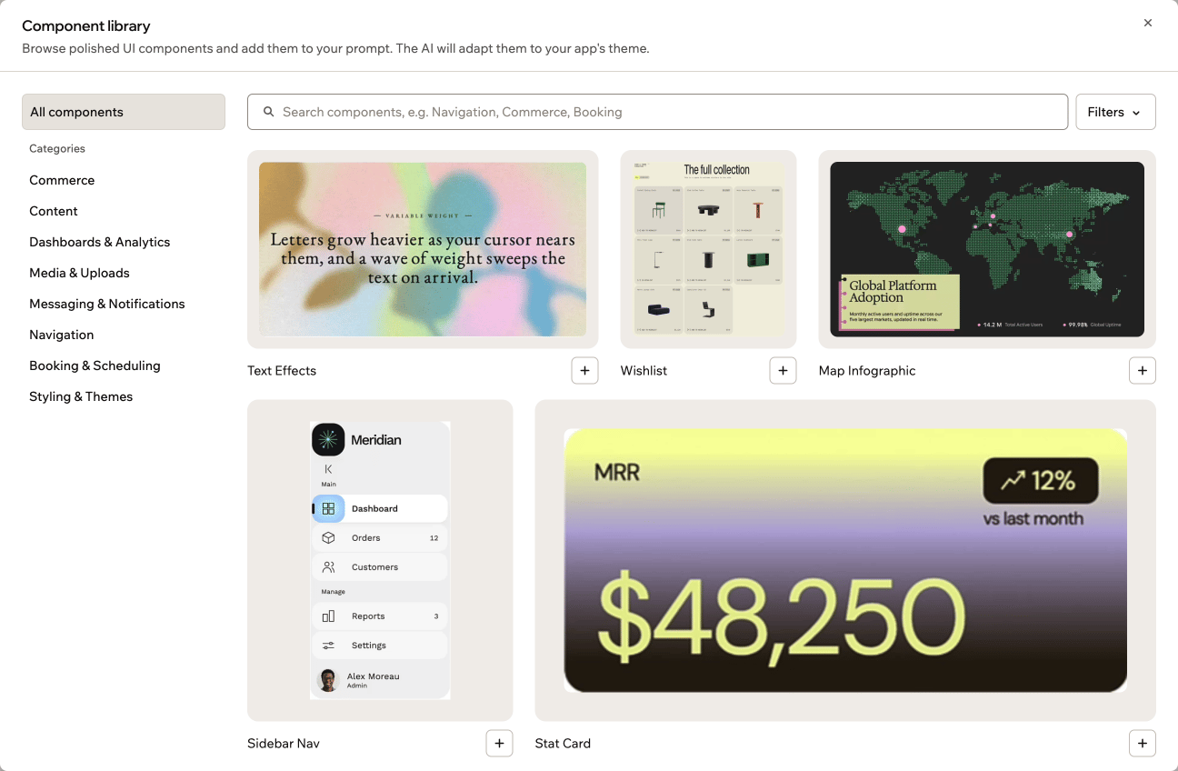
The component library in your app editor
Opening the component library
You open the component library from the plus menu in your AI chat, next to where you type your prompts. To open the component library:- Go to your app editor.
- In the AI chat, click the plus icon next to the prompt box.
- Click Explore component library.
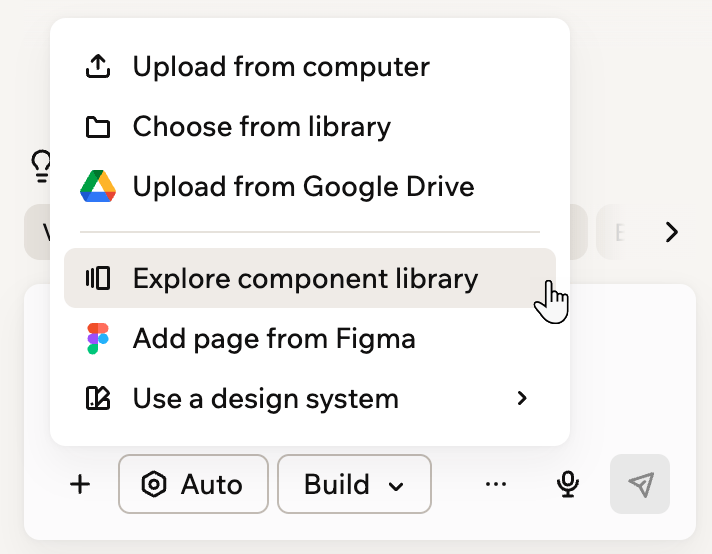
Opening the component library from the plus menu
Browsing and previewing components
The component library opens in a large window, with a search box at the top and a list of categories on the left. All components shows everything in the library, and each category groups components by purpose, such as Commerce, Navigation, and Booking & Scheduling. You have 3 ways to find a component:- Search: Type a keyword in the search box. It searches the category you have open, so choose All components first to search the whole library.
- Categories: Click a category on the left to see only its components. On a phone, the categories appear as a row above the search box.
- Filters: Click Filters to narrow the list by tag.
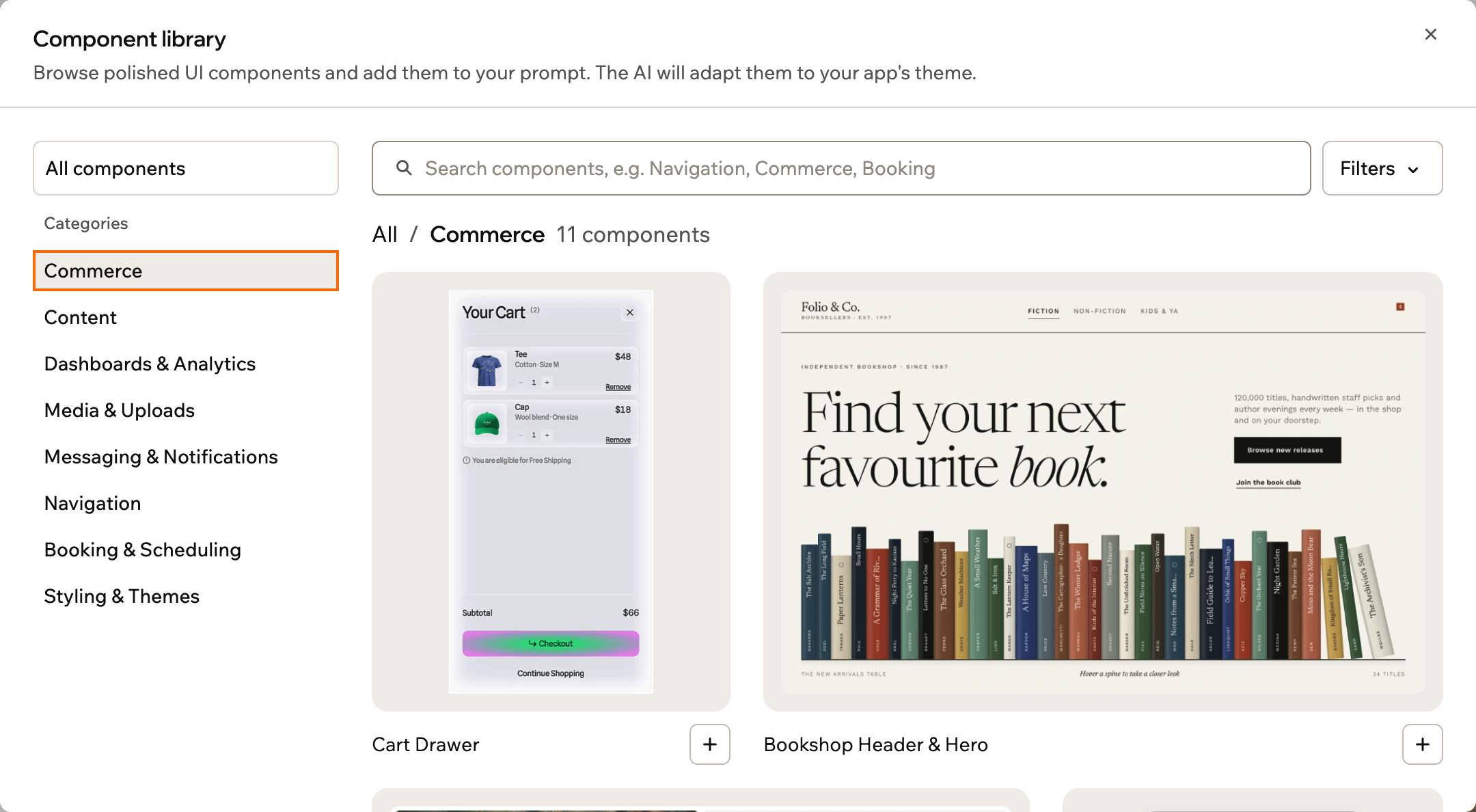
Browsing a category in the component library
Adding a component
From a component’s details, you tell the AI how to use it, then add it to your prompt or build it right away. You add one component per message. When you send the message, Base44 rebuilds the component as React code inside your app and adapts its styling, fonts, and copy to match your design. To add a component to your app:- Click the plus icon next to the prompt box in the AI chat in your app editor.
- Click Explore component library.
- Click the component you want.
- Under How should the AI use it?, describe where it goes, such as a page or section. This step is optional.
- Click Add to chat to place it in your prompt so you can edit the message first, or click Build now to send it right away.
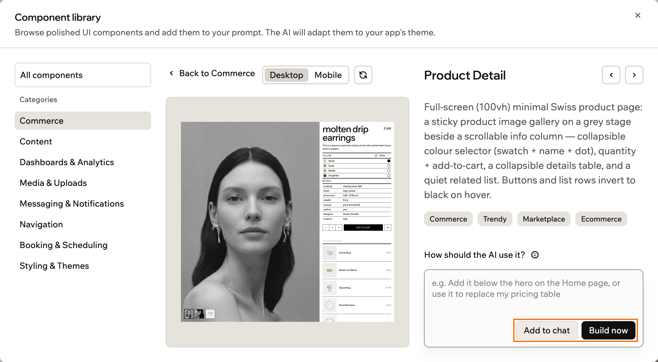
A component's details, with Add to chat and Build now
More about adding components:
- Quick add: To add a component without opening its details, click the + on its card.
- Looking again: To see a component again later, click its chip in the prompt box or above the message you sent.
- New code libraries: If a component relies on a code library your app doesn’t have yet, Base44 asks you to approve installing it as part of building the component. Learn more about adding and using npm packages.
FAQs
Click a question below to learn more.Can I add more than one component at a time?
Can I add more than one component at a time?
You add one component per message. To add another, open the component library again and repeat the steps.
Does adding a component cost extra credits?
Does adding a component cost extra credits?
No. Adding a component is a standard build message, so it uses credits the same way any other prompt does. There is no separate charge for browsing or adding a component.
Can I change a component after adding it?
Can I change a component after adding it?
Yes. A component becomes part of your app once it is built, so you can ask the AI chat to restyle it, change its content, or adjust its layout like any other part of your app.