Once you know how to customize your app’s design, these foundations help you keep it consistent, well-structured, and accessible as it grows. This page covers building a consistent design, working with images and visual assets, responsive layout and page types, advanced customization, and accessibility.

Keeping your design consistent

These sections cover how to establish consistent, app-wide design patterns using the AI chat, so your colors, type, spacing, and components feel cohesive across your app.

Color system

Color is one of your strongest tools to set mood and guide attention. Start by defining roles rather than random hex codes. Aim for:
  • 1 primary brand color
  • 1 secondary color
  • 1 accent color for highlights
  • 3 to 5 neutral grays for backgrounds, surfaces, and borders
  • Clear colors for success, warning, and error states
You can ask AI to propose and apply a full system from scratch:
Create a color system for this app:
- 1 primary brand color
- 1 secondary color
- 1 accent color for highlights
- 4 neutral grays for backgrounds, surfaces, and borders
Map colors to roles such as primary, surface, border, success, warning, error.
Ensure text on backgrounds meets accessibility contrast levels.
Apply this system across the app and replace one off colors.
Keep color meaning consistent. For example, only use your success color for positive states and your error color for problems, not for decoration.
If you already have hex codes from a brand guide or an external tool, paste them in and let AI map them to roles:
Use this palette and assign each hex to a role:
- #1D4ED8
- #6366F1
- #10B981
- #F3F4F6
- #111827
Define which are primary, secondary, accent, and neutral roles.
Replace hard coded colors with tokens or Tailwind classes that follow these roles.
You can upload a screenshot or image of your color palette directly to the AI chat and ask it to apply the colors to your app:
Apply the colors from this image to my app.
Map each color to a role such as primary, background, foreground, and accent.
Replace existing colors across the app to match.
Changing the color palette of a Base44 app

Typography system

Typography controls how readable and scannable your app feels. It is better to have a few clear text styles than many similar ones. Define roles such as:
  • Page title
  • Section heading
  • Body text
  • Small metadata such as labels and timestamps
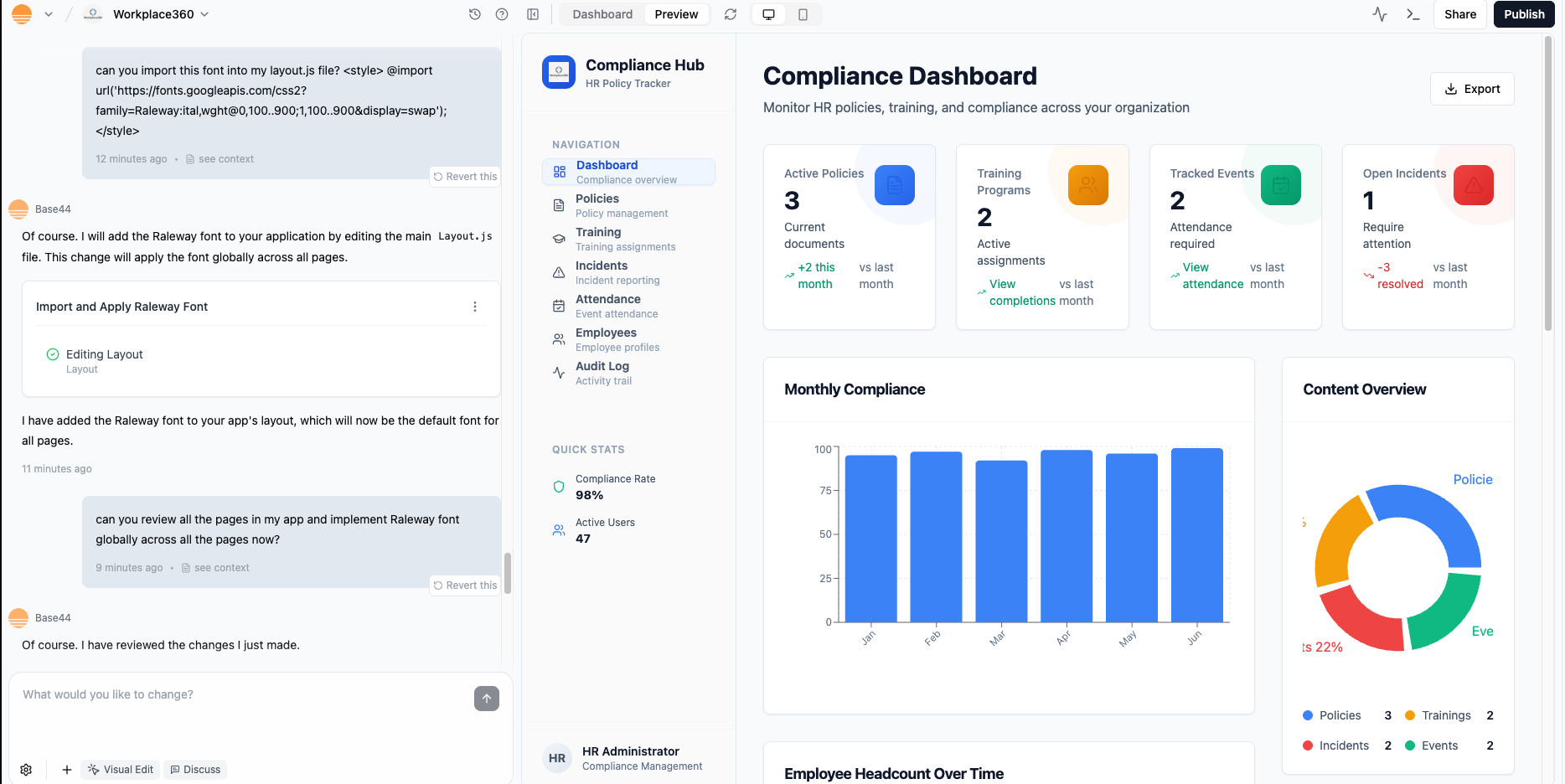
You can ask the AI to set this up and apply it everywhere:
Set up a typography system:
- Page titles: largest size, bold, modern sans serif
- Section headings: medium size, semibold
- Body text: standard size, regular weight
- Metadata: small uppercase with extra letter spacing
Apply these roles consistently across all pages and remove ad hoc font sizes.
You can also target sizes more directly:
Make typography more readable:
- Increase base body text size slightly
- Increase line height for paragraphs
- Ensure headings are at least 1.4x the size of body text
Keep font families the same.
You can use custom fonts and apply them through your layout.
  1. Get the embed snippet (for example from Google Fonts at https://fonts.google.com).
  2. Ask AI to add it to Layout.js and wire it into your type system.
Example prompt:
Import the "Raleway" font from Google Fonts.
Use it for page titles and section headings.
Keep the current body font for paragraphs.
Update styles across the app to follow this rule.
Using a custom font in the Base44 layout file
Try to limit yourself to one or two font families. Too many fonts make the interface feel unstructured and harder to maintain.

Spacing and density

Spacing and density control how comfortable your app feels to use. A simple spacing scale prevents random gaps and cramped sections. You can define a scale such as 4, 8, 12, 16, 24 and ask AI to apply it:
Normalize spacing using this scale: 4, 8, 12, 16, 24.
- Use larger values between major sections
- Use medium values inside cards and panels
- Use small values between labels and inputs
Reduce areas that feel cramped and avoid random spacing values.
If a page feels crowded or too empty, you can let the AI chat diagnose and fix it:
Look at this page and adjust spacing:
- Add more top and bottom padding around each section
- Increase the gap between rows of cards
- Ensure long paragraphs have a comfortable line length
Keep the existing colors and content.

Core elements and states

Once color, type, and spacing are in place, standardize the building blocks you use everywhere. Focus on:
  • Buttons (primary, secondary, and text only)
  • Cards and panels
  • Navigation bars and sidebars
  • Form fields (default, focus, error, disabled)
  • Chips, tags, and badges if you use them
You can ask AI to detect and unify patterns:
Standardize core elements:
- Buttons: define primary, secondary, and text only styles
- Cards: define corner radius, padding, shadow, and header/body layout
- Navigation: define active, hover, and disabled states
- Form fields: define default, focus, error, and disabled states
Apply these patterns across the app and replace mismatched styles.
This gives you a reusable language so new pages look like they belong to the same product.

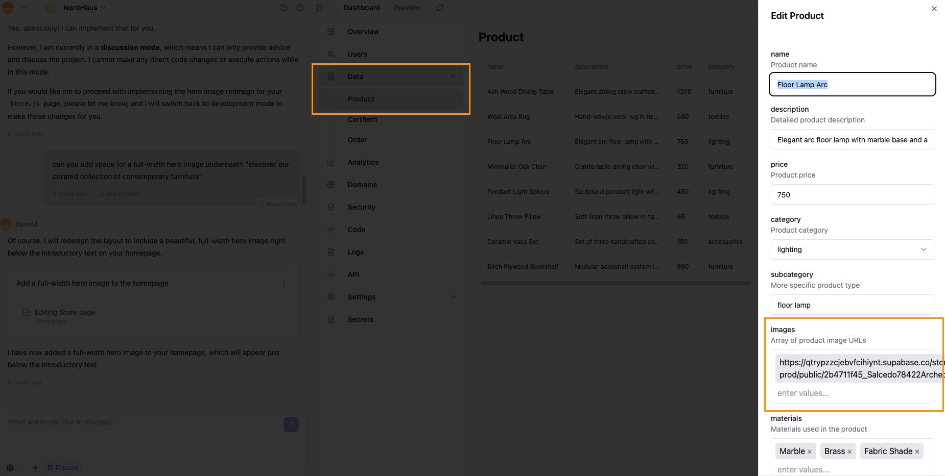
Images and visual assets

Visual assets such as images, icons, and videos shape how your app feels. AI can help you create, place, style, and connect them to your data and code.
Upload images or videos to the AI chat to give it visual context for your app’s style, layout, or content.You can ask the AI chat to add hero images directly to your pages:
Add a full width hero image to the homepage that matches the current color palette.
Use a placeholder image that suggests a modern analytics dashboard.
Hero image example in a Base44 appTo replace a placeholder image:
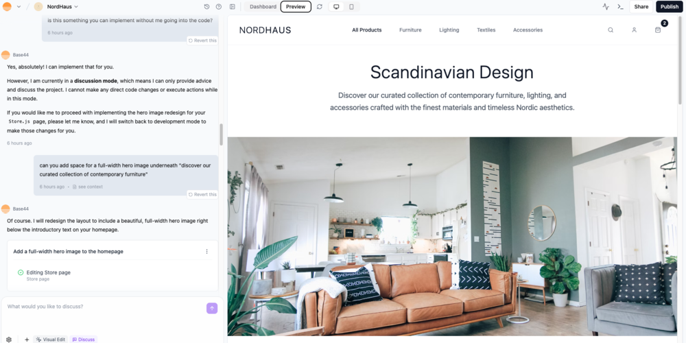
  1. Open the relevant page file such as Store.js in code view.
  2. Find the <img> tag.
  3. Update the src attribute with your own image URL.
You can also upload images for entities in the Data section and bind them to components so cards and lists display the right images automatically.Managing entity images in the Base44 Data section
Ask the AI chat to generate short videos for visual sections such as heroes, product previews, tutorials, or onboarding screens.Example prompt:
Create a short onboarding video for my fitness app showing a simple morning workout routine. Add it to the welcome screen above the Get Started button.
Generating videos from the AI chat requires a Starter plan or higher. Each generated video uses the prompt’s message credits plus 1 additional message credit.
You can also let people generate videos in your live app. Learn more about generating videos.
Reference images help you steer design visually by showing the AI chat a style, layout, color palette, or visual direction you want to use.Uploading a reference image for app design inspiration
  1. Click the Upload icon (+) on the AI chat.
  2. Upload an inspiration image or screenshot.
  3. Tell AI exactly what you want to borrow and what to ignore.
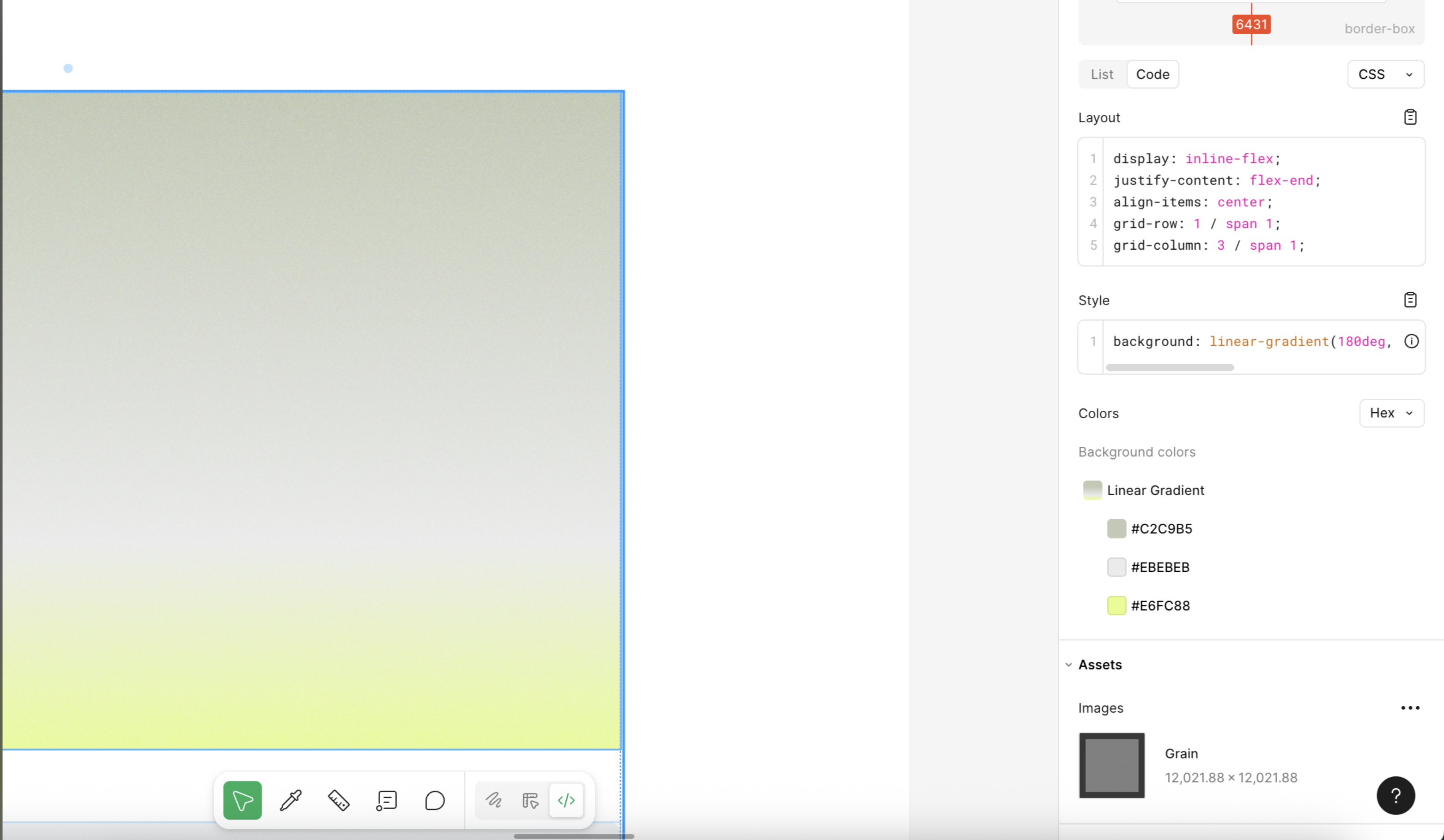
Prompt ideas:
Use this reference as inspiration.
Keep my layout and content, but:
- Match the button shapes and shadows
- Match the card corner radius and border style
- Apply a similar soft gradient only to the top header
Do not copy the exact colors, just the structure and feel.
From this screenshot, extract design rules for:
- Color roles
- Font sizes and weights
- Corner radius and shadows
- Spacing between sections and cards
Explain the rules, then apply a similar style using my current brand colors.
You can copy visual styles directly from a design tool such as Figma and ask Base44 to apply them, instead of trying to describe every detail in words.To copy from Figma:
  1. In Figma, select the element whose style you want to copy.
  2. Switch to Dev mode and view the Code panel.
  3. Copy the relevant CSS line, for example a gradient background: background: linear-gradient(180deg, #C2C9B5 -1.25%, #EBEBEB 68.58%, #E6FC88 104.25%);
  4. In Base44, open Visual Edit and select the matching element.
  5. Paste the style into an AI prompt and tell Base44 exactly what to change, for example:
Change the background style of this element to:
background: linear-gradient(180deg, #C2C9B5 -1.25%, #EBEBEB 68.58%, #E6FC88 104.25%);
Keep all other styles the same.
This lets you match gradients, shadows, borders, and other styles from your design file very precisely.Figma Dev mode showing CSS and gradient background for a selected element
Icons should support meaning, not just decoration. Consistency is key.Common tasks:
  • Replace generic icons with more meaningful ones.
  • Align icon sizes and stroke widths.
  • Pair icons with text labels where clarity matters.
You can use icon libraries such as Lucide and ask the AI chat to wire them in:
Replace generic icons with more meaningful ones:
- Use icons that clearly match each navigation item and main action
- Keep icon size and stroke width consistent
- Align icons neatly with labels in navigation, lists, and buttons
Update all primary call to action buttons:
- Use the "sparkles" icon to the left of the label
- Keep icon size small and padding even
- Do not add icons to secondary or destructive buttons

Layout and responsiveness

Layout controls how information is grouped and scanned. Responsiveness ensures that layout works on every device.
Think in page types rather than one off screens:
  • Landing and marketing pages
  • Dashboards
  • Lists and tables
  • Detail pages
  • Forms and wizards
  • Settings and profile pages
You can ask the AI chat to detect and standardize patterns:
Identify the main page types in this app (landing, dashboard, list, detail, form, settings).
For each type:
- Propose a consistent layout structure
- Suggest which existing components to reuse
Apply those layouts to all pages of the same type, without changing content.
Hierarchy and white space help people see what matters at a glance.Ideas you can ask AI to apply:
Improve visual hierarchy and white space on this page:
- Make the page title clearly stand out above other text
- Use consistent section headings to group content
- Add more top and bottom padding around each section
- Increase the gap between rows of cards
Avoid adding new colors or fonts.
Whitespace is especially important for dense content such as dashboards and tables, so give key elements room to breathe.
Your app needs to feel natural on phones, tablets, and desktops.You can encode responsive rules in a single prompt:
Make this layout responsive:
- On phones, use a single vertical column and stack sections
- On tablets, use two columns for cards where space allows
- On desktops, use three or four columns for cards
Keep images in a 4:3 aspect ratio.
Collapse the sidebar into a top menu on smaller screens.
Avoid horizontal scrolling at all breakpoints.
Use the device preview in the Base44 editor to check how these rules behave on different screen sizes, then refine them with follow up prompts.

Customizing your app for mobile

Your Base44 app automatically adjusts its layout for any device, but you can use the editor’s mobile preview and customization tools to fine-tune how your app looks and works on mobiles. This lets you create a comfortable, seamless experience for mobile users.
Viewing the mobile version of your app in the Base44 app editor
To customize your app for mobile:
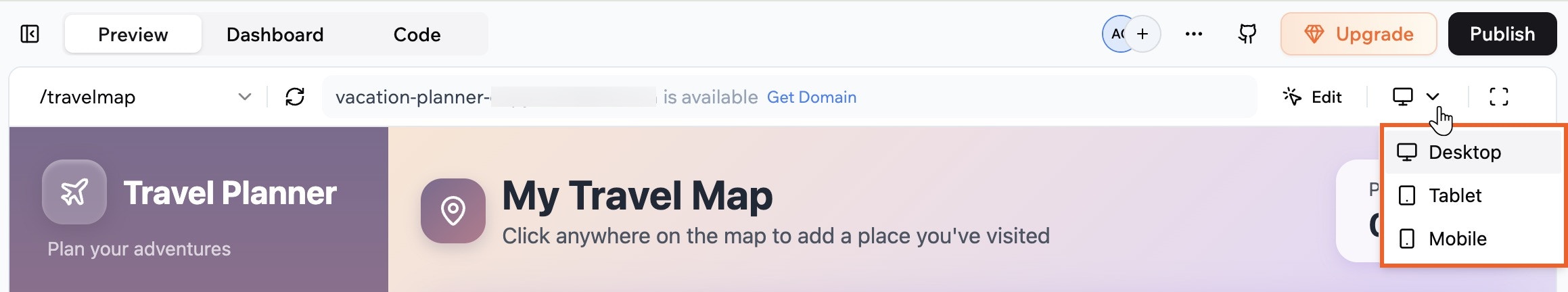
  1. Go to your app editor.
  2. Click the Screen icon at the top and select Mobile.
  3. Review your layout, navigation, and content.
  4. Make changes as needed either by:
    • Asking the AI chat to make changes to mobile.
    • Using Edit mode in the AI chat to change the design or layout of specific elements.
Tips to make your app look good on mobile:
  • Make sure the text is readable
  • Resize elements to fit the mobile screen
  • Hide or show elements as needed
  • Ensure buttons and icon buttons are easy to tap
  • Check that images look good

Page types

Different page types need different design choices. You can use these patterns as starting points and adapt them with AI.
Focus on a clear promise, one main call to action, and strong visual hierarchy.Design tips:
  • Use a simple header with minimal navigation.
  • Make the hero section clear and focused, with a short headline and one primary button.
  • Use supporting sections for benefits, features, and social proof.
  • Keep forms short and above the fold when possible.
Prompt example:
Design the homepage as a focused landing page:
- Clean hero section with a short headline, one supporting sentence, and one primary call to action
- Follow with three key benefits in cards
- Add a simple social proof section with logos
- Keep navigation minimal
Use my existing color and typography system.
Dashboards should answer “How am I doing?” at a glance.Design tips:
  • Put the most important metric or status near the top left.
  • Group related metrics in cards with clear titles and short descriptions.
  • Avoid too many chart types on one screen, reuse a few standard ones.
  • Keep filters and time ranges clearly visible and consistent.
Prompt example:
Restructure this dashboard:
- Place the main KPI at the top left in a prominent card
- Group related metrics into a 2x2 grid of cards
- Move filters and date range controls into a clean top bar
- Reduce visual noise in charts by using consistent colors and styles
Lists and tables let people scan and act on many items.Design tips:
  • Use clear column headings with enough spacing.
  • Keep row height comfortable, not too tight.
  • Use zebra striping or subtle row separators for large tables.
  • Keep actions either at the end of the row or in a consistent menu.
  • Add empty, loading, and error states.
Prompt example:
Clean up this table view:
- Increase row height slightly
- Use subtle row separators or zebra striping
- Align actions in a consistent column at the end
- Add a clear empty state with a short message and primary action
Detail pages should make the main object and its key actions obvious.Design tips:
  • Put the object title and primary actions near the top.
  • Use a clear layout with one main content column and optional side panel.
  • Group related information with headings or tabs.
  • Keep destructive actions visually distinct and placed carefully.
Prompt example:
Improve this detail page:
- Move the main title and primary actions to the top of the page
- Use a two column layout with main content on the left and secondary info on the right
- Group related fields under small headings
- Make destructive actions clearly labeled and visually distinct
Forms are where many key flows happen. They should feel simple and forgiving.Design tips:
  • Group related fields under headings.
  • Use a single column layout for most forms.
  • Show progress for long, multi step flows.
  • Place error messages near the fields and make them clear.
  • Use clear labels and helper text.
Prompt example:
Redesign this form for clarity:
- Use a single column layout
- Group related fields under short headings
- Add clear labels and helper text where needed
- Show inline error messages under each field when validation fails
Use my existing typography and spacing system.

Advanced customization

When you want to go beyond what AI and Edit mode give you out of the box, you can bring in your own code and npm packages. AI can still help you wire and align everything.
You can use npm packages to bring richer motion, visual effects, and interactive components into your Base44 app without building everything from scratch. Packages come from the public npm registry and are installed through the AI chat in your app editor, so you stay inside the same workflow.Design-focused examples include:
  • Animation libraries (for example, anime.js) to add transitions, hover effects, and micro interactions.
  • UI component or motion libraries to handle modals, tooltips, carousels, or step flows with built in interaction patterns.
  • Chart and graph utilities to visualize data with custom colors, typography, and spacing that match your app.
  • Drag and drop or gesture libraries to make layouts feel more tactile and interactive.
  • Date and time helpers to format timestamps and schedules in a way that fits your UI.
After a package is installed, you can use AI chat to:
  • Import the right functions or components from the package.
  • Wire them into your existing layout and design tokens (colors, typography, spacing, radius).
  • Adjust props, variants, and motion so they feel consistent with the rest of the app.
  • Check accessibility details like focus states, keyboard navigation, and reduced motion preferences.
Prompt example
I added the framer-motion npm package. Refactor the existing card grid so each card animates on hover using framer-motion:
- Keep the current layout and copy
- Use the existing color tokens, border radius, and typography
- Respect prefers-reduced-motion and keep keyboard focus outlines clear
All npm packages are third party code. Base44 cannot guarantee their quality or security, so make sure you review the package README, test it in your app, and confirm it meets your project’s design and performance requirements.
Base44 apps often use Tailwind CSS utilities. AI can help you refactor messy styles into something more systematic.Tasks you can ask AI to do:
  • Replace inline styles with Tailwind utilities.
  • Extract repeated patterns into reusable components.
  • Map color values to design tokens and Tailwind config.
Example:
Refactor these components to use consistent Tailwind classes:
- Replace inline style attributes with Tailwind utilities
- Use the design tokens for colors, spacing, and typography
- Document the main class combinations for navigation, cards, and buttons
Sometimes you want precise control over layout, animation, or component structure. You can open code files directly and either edit them yourself or ask AI to do it.Common design related edits:
  • Updating Layout.js to change global wrappers, headers, or footers.
  • Adjusting theme providers or context.
  • Changing how components are composed and which props they accept.
To edit the code:
  1. Open the relevant file.
  2. Paste a code snippet into AI chat.
  3. Ask for a change, then review the diff or preview.
Example:
Here is my Layout.js component.
Adjust it so:
- The header is sticky on scroll
- The main content has a max width and is centered on large screens
- The background color uses the surface token from my design system
Explain what you changed in comments.
Design choices affect performance, especially when you introduce packages and heavy visuals.Keep in mind:
  • Use optimized image sizes rather than huge background assets.
  • Avoid loading many heavy animations or large libraries on initial load.
  • Lazy load rarely used sections such as deep reports or advanced filters.
  • Reuse shared components instead of many near copies.
You can ask AI for a performance focused review:
Review this app's design from a performance perspective:
- Identify heavy visual or code related elements that might slow loading
- Suggest lighter alternatives that keep the same overall look
- Propose specific places where lazy loading or code splitting would help

Accessibility

Accessibility is part of good design. It helps more people use your app comfortably and can improve clarity for everyone.
Color choices have a direct impact on readability.Good practices:
  • Use strong contrast between text and background.
  • Avoid using color alone to convey meaning.
  • Keep interactive elements such as buttons and links clearly visible in all states.
  • Check both light and dark modes if you support themes.
Prompt example:
Audit this app for color contrast:
- Identify text or icons with low contrast against their backgrounds
- Strengthen contrast while keeping the same general palette
- Ensure primary buttons and links are clearly distinguishable
Describe the main fixes you applied.
Readable text is about more than font choice.Good practices:
  • Use comfortable font sizes on all devices.
  • Use enough line height for paragraphs.
  • Avoid very light weight fonts on light backgrounds.
  • Keep line length reasonable, especially on wide screens.
Prompt example:
Improve text readability:
- Increase base body font size slightly
- Increase line height for paragraphs
- Ensure headings are clearly larger than body text
- Reduce very long line lengths on wide screens
People should be able to use your app with a keyboard and see where they are.Good practices:
  • Make sure Tab moves through interactive elements in a logical order.
  • Ensure focus styles are visible and distinct.
  • Avoid keyboard traps where focus cannot move away.
Prompt example:
Improve keyboard and focus accessibility:
- Ensure all interactive elements can be reached with Tab
- Add visible focus styles to buttons, links, and form fields
- Fix any focus order issues on this page
Describe any major changes you made.
Motion can help or hurt. Some people prefer less of it.Good practices:
  • Respect reduced motion preferences.
  • Avoid rapid flashing or strong flicker.
  • Use subtle, purposeful animations rather than constant motion.
Prompt example:
Adjust animations for accessibility:
- Respect the user's reduced motion preference
- Remove or simplify large continuous animations
- Keep only short, subtle motion that helps understanding
Clear language and descriptions help everyone, including people using assistive tech.Good practices:
  • Use clear, descriptive labels for buttons and links.
  • Provide meaningful alt text for important images.
  • Use headings to structure content.
  • Avoid vague link text such as “click here”.
Prompt example:
Improve accessibility of labels and alt text:
- Make button and link labels more descriptive where needed
- Add or improve alt text for important images
- Ensure headings follow a clear structure
Keep the tone and brand voice the same.

FAQs

Click a question below to learn more about design foundations and layout.
Design for mobile, tablet, and desktop separately, then check how your layouts adapt.Use these guidelines when you design in Base44:
  • Mobile: Use a single vertical column, keep one clear primary action per screen, and make tap targets large with enough spacing. Keep text short so people do not need to zoom.
  • Tablet: Treat tablet as a hybrid. You can use side menus or split layouts, but keep buttons touch friendly and avoid very small tables or dense controls.
  • Desktop: Use the extra width for multi column layouts and sidebars. You can add hover effects, but any important action must also work with a click or tap.
  • All devices: Use readable font sizes, avoid horizontal scrolling, and let elements stack instead of overlap when space is tight. Avoid fixed heights that cut off content.
You can also ask AI to apply responsive rules, for example:
Make this layout responsive for mobile, tablet, and desktop.
Avoid horizontal scrolling and keep primary actions visible without excessive scrolling.
Design choices have a direct impact on how fast your app loads and feels. When you design in Base44, keep these guidelines in mind:
  • Use optimized image sizes so large assets do not slow down initial load. Prefer compressed formats and avoid uploading images much larger than they appear on screen.
  • Limit heavy animations and complex effects, especially in mobile heavy apps. Short, simple transitions are fine, but avoid constant motion or large animated backgrounds.
  • Keep layouts clean and focused. Fewer layers, overlays, and nested components usually mean faster rendering, especially on lower end devices.
  • Reuse components instead of creating many slightly different versions. Shared components are easier to cache and maintain.
  • Avoid loading everything at once. Where possible, load non critical content later, for example secondary sections, long lists, or rarely used panels.
  • Be careful with third party embeds such as maps, video players, and widgets. Only include them where they add real value, and avoid stacking many embeds on a single screen.